This article is also available in:
French
The Source of the mountains is a beautiful and mesmerizing thesis short film created by Camille Di Dio, Marianne Moisy, Briag Mallat, Benjamin François, Adrien Communier and Pierre Gorichon at ESMA, a French School of applied arts.
The film was released online and recently became Oscar-Qualified: which is why we present you both the short film and an interview with the team behind it!
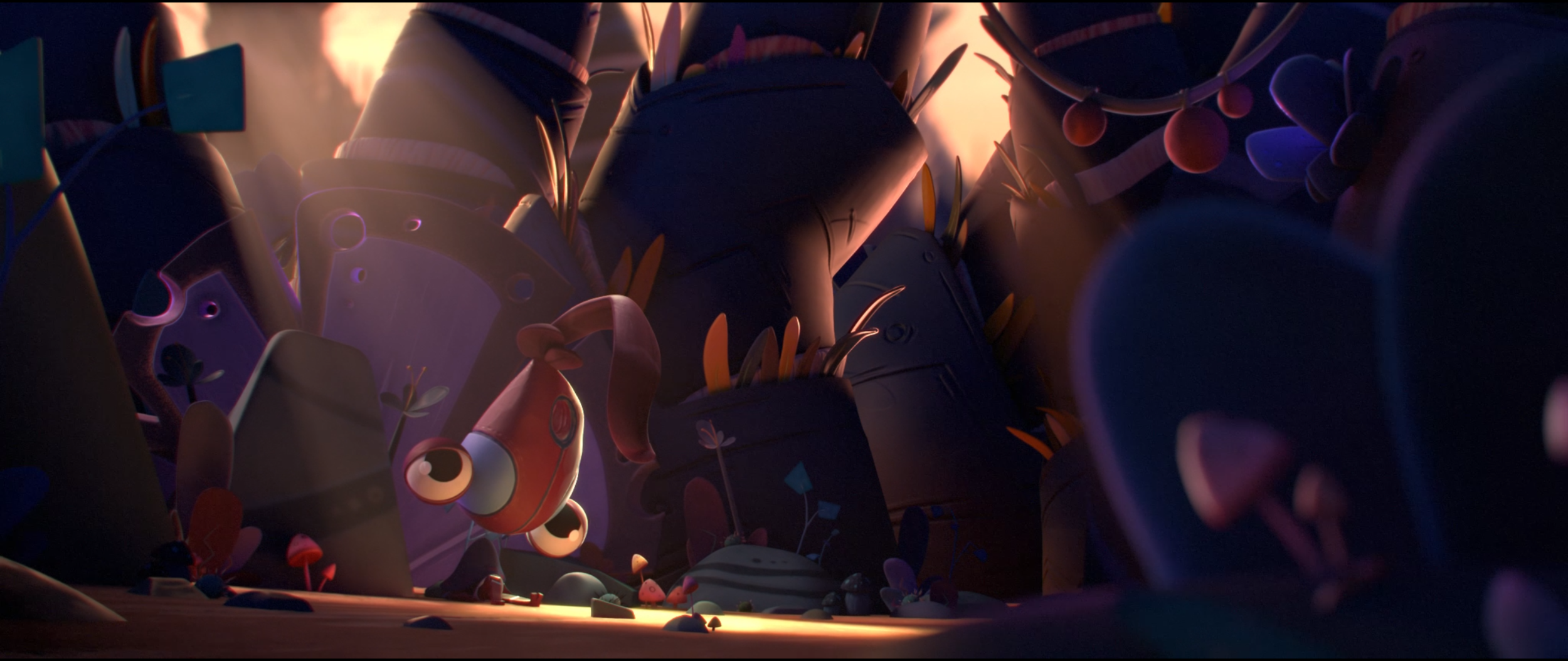
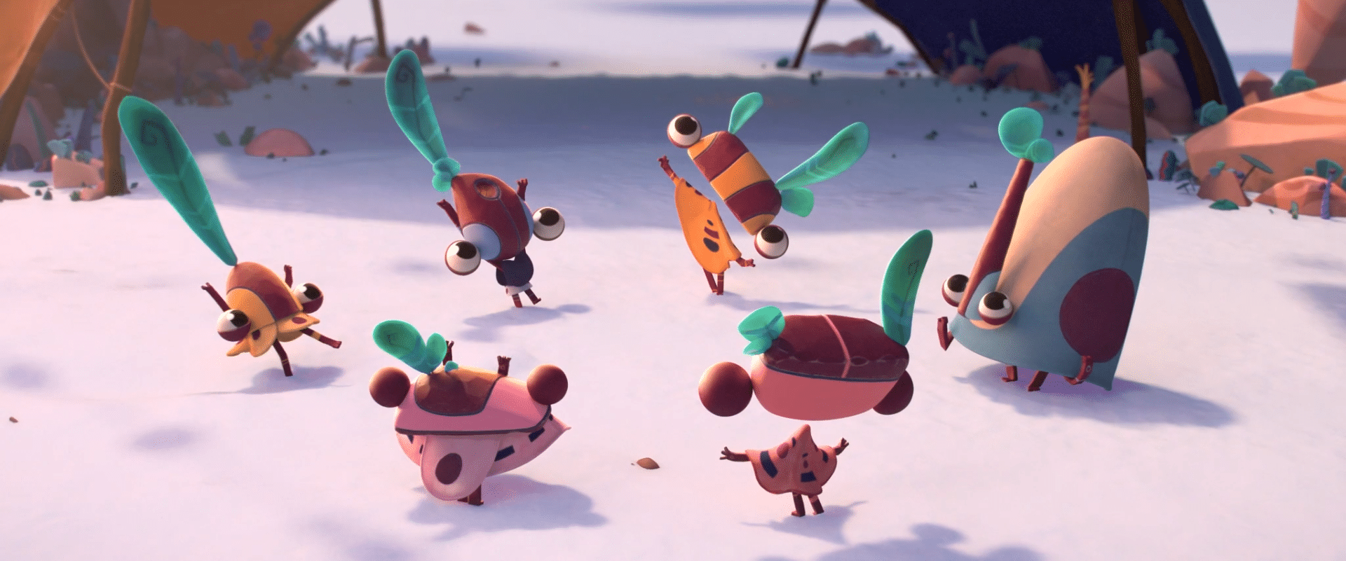
The Paccha-Picchus are festive little creatures. They live a carefree daily life in sync with the mountains. When the mountains come, their oasis rises and they are lifted up into a winter climate. The Paccha-Picchus are very fond of the winter climate, which is vital for them. But one day, the mountains stop coming and the restless Kinko decides to go looking for them.
3DVF: The Source of the Mountains tells the story of the Paccha-Picchus, little creatures living in sync with the mountains. How did you come up with this story?
The Directors: The idea for the story came from a misunderstanding. Camille was telling Benjamin that as a child she used to say that she got “moon burns”, which led to confusion as he thought she was talking about a lunar neck. [Editor’s note: in French, “sunburn” and “sun neck” have the same pronunciation, hence the confusion]
They both visualized some kind of giant space animal with a neck like a moon, and it immediately became a space giraffe.
Then we imagined what life would be like for the people who would populate this creature.
This is how the Paccha-Picchus were born.

3DVF: How did you share the tasks/workload within the team?
Everyone was a director, meaning everyone had a say in every decision. We tried to allocate the roles as organically as possible to make everyone happy. Thanks to our teachers who formed the team, everyone was interested in a different part of the production so it worked out well.
For the pre-production, we all worked on the story together. Then some worked on design, color script, while others focused on finding solutions for the technical problems that we were going to face.
As for the production, Pierre worked the most on modeling, layout, set dressing, animation and Maya FX. Briag worked on rigging, Houdini FX (plant/mountain simulation) and script wizardry. Benjamin worked on lighting, rendering. And procedural shading. Adrien worked on layout and animation, Camille worked on the surfacing, matte painting, compositing, And Marianne worked on the sculpt, compositing and character surfacing.

3DVF: Can you walk us through the character design process?
During the summer before the film’s production, we worked on creating our first Paccha-Picchu [we often shorten them as PP].
We knew the tribe/family part would need a graphic language in order to work, so we preferred to concentrate on designing one alone and then grab from him the graphic codes necessary for designing the others.
Of course, it wasn’t that simple, but it helped to narrow down the things that worked and the ones that clearly did not.
Finding these graphic codes led us to a better understanding of what we wanted the world to look like, the feeling it was supposed to give throughout the story.
KinKo for example, the story’s hero, has this asymmetrical head. One side is quite round, but the other side is a straight vertical line, as if the general shape had been cut. That’s something that really spoke to us; it created rhythm, contrast, directionality, and it’s also a symbolic idea. This straight vertical line stopping this round shape was a way to connect him to the end of the world he’s going to, a giant cliff from which the round mountains start their way.
We tried to implement a bit of that in every Paccha-Picchu, to give them something unique that would work only with a specific individual, linked to its personality, its part in the story.
Of course, as their design was not meant to be mathematical but rather organic, nothing was forced on a PP if it felt wrong. They were, for instance, supposed to have a color line in the middle of their faces, but in the end, only half of them really has it.
The Giraffe came late in the preproduction. We think we were kind of avoiding her! When you have to draw “Everything the world is depending on”, it’s not that reassuring! But the truth is, design-wise, “she” was depending on “everything” else. As finding our graphical language, our world rules, the feeling we were working toward, made her simply appear on paper. In one sketch we had her. The followings were mostly for proportions sake, but nothing was more defining than this first drawing.
In the end, we were feeling more at ease with the graphic language of our (not so) little universe.
3DVF: Why did you choose to animate the characters on twos? And how hard was it to convey emotions without any mouth or eyebrow?
From the beginning, we pictured the Paccha-Picchus as rhythmic characters. As their designs are always broken up to avoid perfection, 12 fps allowed us a choppy, handmade look that pursued the same goal.
Our references were all 12 fps, it seems like it’s helping to create poetry in animation. It allowed us more freedom in posing and timing.
It’s also less time-consuming, as it allows quite limited animation. For example, some background characters could stay still for a time without looking too lifeless.
To express emotions, body gesture was the most important. Since the Paccha-Picchus have a peculiar look, we tried to animate them as little children so we could relate to them.
For their eyes, the tiniest change in the size of the pupil, the eye direction or the shape of the eyelids emphasized a different emotion.
We found something poetic about limiting their range of expression, like the scarecrow character in “Howl’s Moving Castle” for example. It was a way to distance ourselves from cartoony animation.


3DVF: How did you work on the set dressing of the village?
Set dressing the village was an important and long step for our short film. This is the environment where more than half of our film takes place, so we had to make it as lively as possible.
The village is composed mainly of plants and rocks. The main element was the dome, where our little creatures sleep. We wanted the village to be enclosed in a natural way. Each element has a particular and specific place.
Plants grow mainly in the shadows: under canvas that surrounds the village and under the dome. They are supported by large rocks called “Tirochés” [Editor’s note: this name could be translated as “SmolRocks”].

Each element of the village was modular so that we could adjust it shot by shot for the sake of composition.
The SetDressing of the end of the world was also important. Unlike the village, there were fewer plants we could use, and it was supposed to give this empty and desolate feeling at first. That is, before the snow came back, for at this point dozens of luminous plants could reveal themselves and punctuate KinKo’s surroundings the same way the planets in the sky do.
Up next: snow, plot twist, music, RenderMan.

